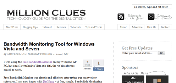
What do I call it? a face life or a strip down? Lets say, I just changed the theme here on Million Clues.
I have always loved the minimal themes that project the content. After hours of Googling and numerous twitter help requests, I ended up with the Perfect Theme Framework – Thematic.
Prime considerations while choosing the Theme were: Large legible font size, White and Minimal Look and Fast Loading pages. I got it all here. It was my first experience with a Theme Framework, learning new stuffs is always great.
There are just 3 images, the header images as part of the theme, the “Advertise Here” image on sidebar and the Connect Image in the Footer. That’s just 10.85 kb!
The cool social media icons used here are from WebTreats ETC. This set comes with 154 icons.
Retweets and Facebook shares are made easy with the BackType Tweetcount plugin and the Simple Facebook Share Button. The Archives page uses the SRG Clean Archives Plugin.
The contact forms are brought to you by the Contact Form 7 Plugin.
Facebook Fan Page
If you are on Facebook, join in the Fan Page of MillionClues.
Also remember to add me, and checkout the MC Twitter Page.
Updates were made to the About and Advertise pages. And the Hire Me page is up. And now I have a footer too.
What do you think?
Have a look, play around and let me know what you think. In case the theme doesn’t render well in your browser, do let me know, thanks.
P.S: The footer doesn’t render well in IE, I couldn’t find a fix yet, any help gets free hugs 🙂


I really like it. It is nice and clean,a nd keeps the focus on your content!
Thats mate, that was the plan. Glad it worked 🙂
More eye pleasing now
Thanks dood 🙂
A minimalistic choice with fast loading and eye soothing choice. Liked it 🙂
Will keep following your articles.
Good choice, A perfect minimalistic eye soothing theme. Liked it 🙂
Will keep following your articles now.
Thanks Rohit, will see you around then 🙂
nice footer & simple , clean visible areas …. i like it
Looks Great!
I am a regular reader of your blog and i am very happy with your new look.
Well done. 🙂
Good to have you back again 🙂
nice clean look.. looks great..
Liked it Arun. Black and white combo always rocks, doesn’t it?
Now you too have a big fat footer that I’m a fan of. Did you consciously change the url structure? (earlier you used to have www in the url’s)
….and also the trailing slash at the end of the url’s which didn’t exist before.
Dude, I wonder how you notice all this, the www is noticable, but the trailing slash? OMG, I should be more careful now. lol
both were done intentionally, it seems that the trailing slash makes pages a little faster.
I am a fan of footer myself, every blog I go, I scroll to the bottom and the page stays there for a while on my browser (for links to tweet and so on).
Thanks for dropping 🙂
If possible, don’t play with permalinks any more. Already there’s some bad news for you (which I experienced previously). I don’t want to tell you what’s that, find out yourself..
woo, wondering what that is, let me see if I can find out 😉
Stopped all games, right now its perfect.
I think I found what you were talking about, the PR is down. Something to work on now 😉
Really really good theme bro.. Super fast loading and clean interface is what I <3…
@Jaspal @Rishabh @Sinu @Ankit – Thanks for the compliments, guys 🙂
Nice, I like it. I have been considering going more minimal lately. I like that you made it about the content.
Good Job,
Chris
Thanks to the links on twitter, out of the tons of links, I found that I read only the ones that have bigger easily accessible fonts, basically the theme that projects the content.
Thanks Chris 🙂
The new theme is fast and also focuses on the content. Good job.
However, I don’t like the “Black and White” type look. Maybe because I like colors! Some colors (maybe blue 😉 ) wouldn’t have hurt! But, as I said, it’s my personal opinion and judging by the comments above, people like minimal look!
Lol, you never stop loving blue, do you 😛
I had intentions to add some colors first, If you had noticed a little earlier, the footer had a reddish border instead of the grey one now.
But I thought it would loose the simplicity, even though the colors are via CSS, it was losing its simplicity. Black and White are my fav’s personally.
I have plans to write a child theme for this one, this is basically the core framework edited. Blue can come in 😉
I will be looking for blue color! 😉
I like Thematic and its simplicity. I would like to see a little more color on the banner though. Probably a refreshing change from other themes would be to make colorful hover effect on RSS icon, email icon and page/category tabs. I would look awesome then, I believe. Also, change the background color of your comments.
There have been some color requests previously, I was thinking how to incorporate them in here without loosing its minimal look, the hover effect is like best of two worlds. Nice idea Ajith 🙂
I tried to do that hover effect on image maps and failed last time. Gotto learn it.
I really love simple and elegant themes. This is one among them. I also DBT’s theme.
Gr8 going.. 🙂
Don’t tell anyone, I was inspired by DBT’s theme myself, shh…. lol
wow…thats a lot of people who love this look….but personally, I hate it! Not that I hate minimal looks, but this one is……….black and white! Life IMO should be a wee more colorful!
But, yes, it does look a lot SEO ready than the church/lifestyle themes.
There have been some color requests previously too. I am a fan of monochrome, the church theme also had black predominantly.
Thinking of incorporating @Ajith’s ideas of adding color as a hover effect. #SomeDay
Love your frankness 🙂
But yes, readers of tech blogs like these either have been reading ur blog thru their RSS readers…..so design should be only for those coming into your blog through those interesting business card of yours or through search/social websites.
Seriously speaking, the design is for me, I am the one seeing it over and over, others see it maybe once or when they drop into comment, thats just 5 minutes. I see it all the time.
I was getting bored with the church theme.
Also, the church theme consumed time in terms of chores like setting the thumbnail image via custom field and like.
Feeling fresh now, feels like writing 🙂
Its a refreshing feeling to linger here in your new layout. But i think its a bit dull in colors
Am a big fan of monochrome myself. I will add some hover effects eventually, thanks for coming in 🙂
Wow!! The theme is really nice Arun! I always love black n white and the footer is awesome! melikes 😀
Good to see you back here dharshana. Lol, total twadict – #melikes 😉
Great theme with neutral color scheme.
Thanks Kannan, thanks for dropping by 🙂
Cool theme , simple and cool 🙂
Good to have you back, thanks 🙂
Fresh and Simple. Thats what in simple words. I liked the change u made from the previous theme, the new one is good and speedy (but not much as i expected). I think the thesis theme is more good. It is speedy and can be customized easily. You can twist it to any look you want. It was just my suggestion. I liked the new theme, for this i would like to see that subscription box in a different color so that people notice it better.
Good Luck Bro.
Hello Amal,
The load time is pretty good here, but sometimes the call to backtype api takes a while (they are slow). I am trying to work around it and make it call after loading the page.
I love the Thesis theme, but I love freebies much more. its not about the money, more about freedom 🙂
btw, the idea of changing color for the box is one great tip, let me see how a color change will work out. Thanks.
Great job! i like the simple theme for tech blog
(^_^)b
Thanks Mrs Twadict 😛
Hi Arun,
A million thanks for helping the community and netizens. I was doing some research on how to write a good blog and keep it as simple and elegant as possible. After a weeks time, I saw your blog. Its one among the best 🙂 . Black & White are like Carrots and Peas. Always Together. I am very much inpisred by your blogs. Will see you around. Thanks 🙂