
The continuous growth in use of mobile devices for browsing the web is not showing any signs of slowing down. Thus, it’s very important that your website must work perfectly regardless of the device it is being viewed on. Thankfully, a responsive design can help to address such need – providing an optimal user experience across all sorts of devices – be it Smartphone, a tablet or a PC.
When creating a responsive design, however, you should understand that it’s not just a matter of stretching and compressing design elements. Rather, it’s about how you deliver your website in numerous ways in accordance with different screen sizes and resolutions. Besides this, building a responsive website design requires you to pay attention to several aspects as listed below:
- What should be added and/or removed?
- Prioritizing what’s important
- How you can adapt your workflow according to emerging devices and so on.
This post will help you learn about the best practices, you should follow while adding responsive to your site.
1. Adjusting Navigation Menus
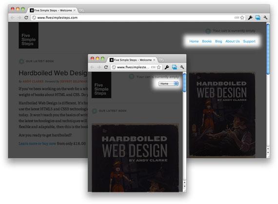
For users using small-screen displays, their navigation requirements will vary compared to the ones with large screen devices. When viewing menu using a small-screen device, it’s important that it fits the screen of the device properly, thereby providing an enhanced user experience. One best way to do so requires displaying navigation in the form of drop-down menu. This helps in hiding the menu containing a long list of nav (i.e. navigation) items into a single-selection list box, as shown in the following screenshot:
Another great solution to adjust your site navigation menu is to use an icon for representation of your nav items, instead of a single-selection box. Using this alternative will help you save more space compared to representing menu in the form of a list box. For example, website Upworthy.com uses 3-line icon for its navigation menu. Clicking on the icon will open up the navigation as drop-down menu.

2. Make “Buttons” and “Text Links” Easily Distinguishable
You may have stumbled upon desktop version of websites having large-size buttons and easy to read clickable links. Large buttons and text links helps improve the usability of the site. And so, when building a mobile version of such website, make sure that the clickable buttons and links can be easily distinguished from the rest of the website content and easier to tap.
In essence, using large buttons and text links doesn’t just apply to small screens, but they should look the same even on different device screens – from touch screen phones to desktops and tablets.
3. Balance Line Height and Font Size
We usually spend a lot of our time in making the text look good on our website structure, however, we don’t pay much attention to testing how the text is rendered on a small screen display. So, when creating a responsive structure, make sure that there is a fine balance between how the line height and font size, as it helps to make the text easier to read. Spend more time in looking at how your type looks when it is being viewed on a smaller device.
In order to make your text is easily readable on whatever device, it is accessed, you need to balance the line height and font size. Make sure the line height should not be too tight. Additionally, you can afford to use small size fonts for smaller devices, but increase font size for devices with large screens.
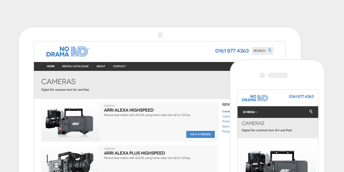
As you can see in the “No Drama” website desktop and mobile screenshots, the font size of the titles on mobile is reduced than the ones displayed on desktop screen.
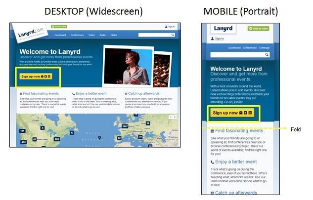
4. Place Important Information on Top Of Mobile
When a user views a website on the desktop, it’s easy to view information regardless of where it is being placed on the website. But, in case of mobile, you need to be sure that your important information, including contact details, or any other call to action buttons, etc. appears as soon as the user lands upon the mobile version of your site.
There’s a greater possibility that mobile users visiting your site for the first time will make a quick exit, if they can’t find the required information instantly. So, make sure that the most important information that you would like your visitors to view is visible to users, without needing them to scroll the page.
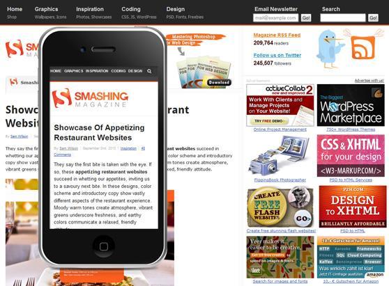
Smashing Magazine website make sure that the information it want users to read is clearly visible in the mobile version of its site.
Let’s Wrap Up!
Irrespective of whether, you’ve decided to do it yourself or planning to bring a professional on-board to get the job done, make sure to go through this post and use it as a resource to know what needs to be done.
Author: Addison Cohen is an application developer for Appsted Ltd, an iPhone app development company. He loves sharing latest information on the latest mobile technology.
This entry was submitted by a guest author. If you wish to contribute, please contact me for my terms.


Very well done. I wrote something similar in my page
I am in the process of converting my current website to a responsive design and these kind of articles give some info as well as inspiration.
Thank you
Nice post will implement on my blog