Many times we have emphasized the importance of the Facebook cover when people connect with us. Although many may not believe it, a good Facebook cover can be the difference between a Fan and a person who simply closes the page without giving us their precious “Like”.
It amazes me to see that some companies and brands use a very simple Facebook cover photo. It is not consistent with the rest of the communications that sometimes it does not even respect the correct size or fails to attract attention.
Nowadays, many brands understand the importance of having a good Facebook cover photo. For that reason, I will share with you 24 ideas to create a Facebook cover photo that really attracts attention and causes an impact.
ARTIST STYLE COVER

It is an excellent way to make a Facebook cover that attracts attention, ideal for those people who are artists or why not brands that have a very particular visual style.
3D STYLE COVER
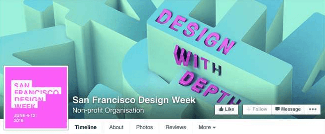
The idea of using a 3D Facebook cover can be very good for design companies, layout companies, architecture studios or even advertising agencies. 3D is a style seen even on web pages thanks to new technologies, so this idea should not be missed.
COVER WITH HISTORY
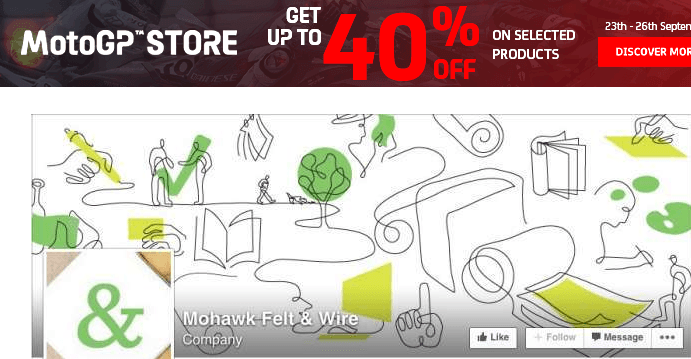
Beyond the simplistic style with which this Facebook cover is designed, you can see that it is about building a story that starts from the left and ends on the right. Why not tell a story with a Facebook cover? Few brands are doing it.
MOCKUP STYLE COVER

If you are a designer, you will be well acquainted with Mockups. A Mockup is like a mockup or a prototype that tends to be photorealistic. Many advertising agencies and designers use them to present how a brand would look, for example, on different media. A great idea to make a Facebook cover that looks like a Mockup.
HANDWRITING STYLE COVER

Another trend seen in many designs is the use of different fonts to create messages and the use of fonts that seem to be written by hand. Using this technique on a Facebook cover can be very striking, attractive and even different.
MINIMALIST STYLE COVER

That Facebook leaves you a large space to put a cover photo. It should be something loaded, full of colors, styles and heavy. You can opt for a Facebook cover that is simple, minimalist and that still causes an impact due to its simplicity.
STYLE FORMS COVER

If you look closely at this Facebook cover, you will notice that the profile photo and the cover photo share the same style of using specific shapes and strokes. Why not apply it with your brand? Adding a special touch to your Facebook cover with this style could be something eye-catching.
COVER STYLE COLOR OVERLAY
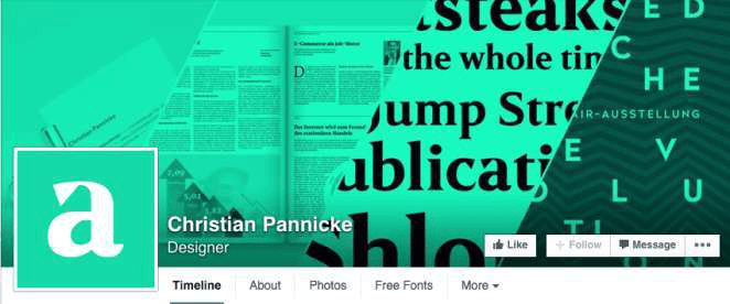
This is another trend seen in many designs and even websites. It is superimposing a color on top of a design to give a general tone to the entire design. Try creating a Facebook cover photo and applying a color overlay to it and seeing how it changes to something more striking.
COLOR PALETTE STYLE COVER
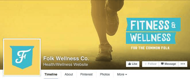
If you look closely, you will notice that the colors combine in a very harmonious way. That’s because it uses a color palette. Try creating a Facebook cover using only the colors from a palette and you will notice a very particular air of harmony.
INTRO STYLE COVER

Another way to take advantage of the Facebook cover is to use it to introduce your brand, product, or service. It’s not about telling the whole story or a super description, just a short message and a shocking image, so people know what they just found.
PHOTO-PALETTE STYLE COVER
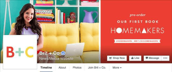
Another quite creative idea to make a Facebook cover is to combine a photograph and another design part, but that the design part has colors based on a color palette of the photograph. In this way, harmony will be maintained throughout the cover, whether it is the background color, typography color, or certain objects’ color.
STYLE MOOD COVER
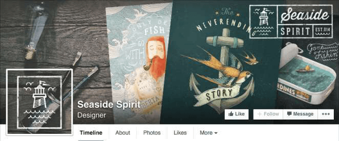
Analyze your brand well. Perhaps it has a very particular style and can transmit a state of mind that, in turn, you can communicate on your Facebook cover. Like Coca Cola, which seeks to convey “Happiness” as a brand, should therefore be reflected in its designs.
ROMBOS STYLE COVER

Why should a Facebook cover only have a horizontal or vertical style? Give it a creative touch by using other geometric shapes such as rhombuses. In the case of this example Facebook cover, the style suits it very well.
MULTI STYLES COVER

If I said that a cover does not have horizontal and vertical designs, I say the same for the style. Why not use multiple styles on a Facebook cover? It’s a great idea to add a creative touch to our Fan page.
BIG MESSAGE STYLE COVER
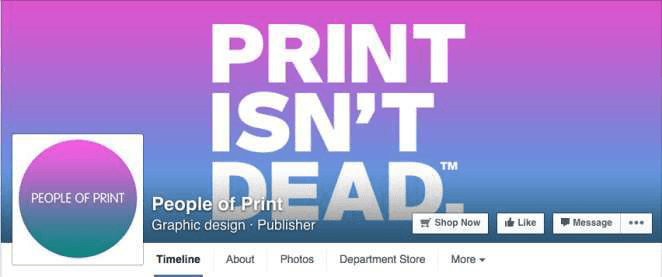
If you have a good message to say with your brand or with your company, why not do it through your Facebook cover? Give it a try. It might look as good as the example above.
TEXTURE STYLE COVER
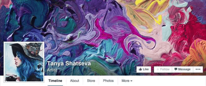
Here’s another pretty creative idea for a Facebook cover photo. Please give it a creative design by creating a textured image. It may not say anything in writing or have no message, but it is still something creative and different that will catch people’s attention.
EXHIBITOR STYLE COVER
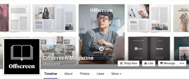
Another great idea for your Facebook cover photo is that you take advantage and display your product in different ways. For example, in the image at this point, you can see how this magazine takes advantage of and shows various parts of its content instead of just doing it with its cover.
TYPOGRAPHIC STYLE COVER
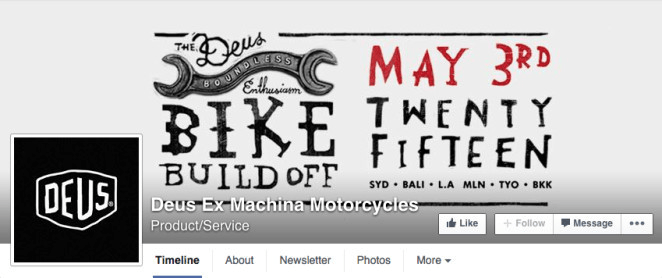
As I said before, a trend that is highly appreciated today is to use a variety of fonts in messages and use fonts that in themselves communicate or convey something—for example, the Facebook cover of this point, which gives that special touch to it.
TEAM STYLE COVER

I remember that one of the covers that most caught my attention a long time ago was one in which the New York Times showed the interior of its building and the hundreds of employees who were part of this medium. You may not have a similar team in your company, but you can still take advantage and create a Facebook cover in which you present your entire team.
PATTERN STYLE COVER
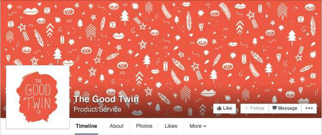
Continuing with the examples of trends that are seen a lot today, patterns are something that is seen a lot in a variety of designs and in recent times, it has taken off quite a bit. Try creating a Facebook cover photo with a pattern that is allusive to your brand. Apart from giving it a creative touch, it can serve to attract people’s attention.
WORK TABLE STYLE
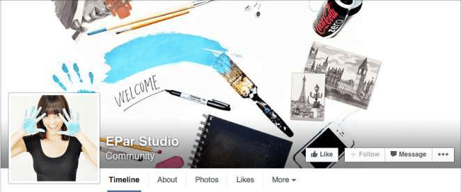
Have you noticed that there is a tendency to take pictures or make designs showing a work table from above? If you noticed, it might be a great idea to take advantage of this style to make a similar Facebook cover for your business.
MULTIPRODUCT STYLE COVER
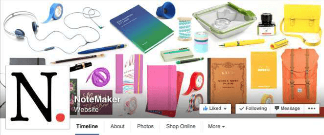
Try making a Facebook cover that shows all or a variety of your products. Of course, give it a certain aesthetic. It is not about putting photographs glued one next to the other, but doing something really striking, congruent and harmonious as in the example above.
DRAWN STYLE COVER
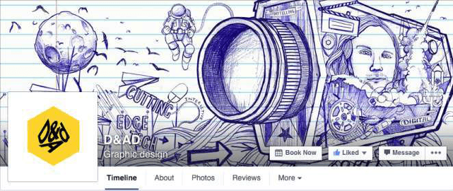
This is one of the styles to create a Facebook cover that I like the most. Making a hand-drawn Facebook cover may not be for everyone and you may even have to hire someone to do it, but there is no denying that it is something very impressive.
CLASSIC STYLE COVER
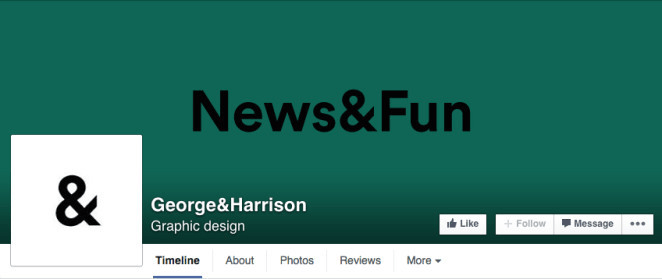
And when you no longer think of what to make of the Facebook cover, never forget that the classic and direct does not fail. Full color or some kind of shadow effect, a simple message and that is it. There is nowhere to get lost.
I hope that this collection of 24 ideas to create a Facebook cover has been helpful, that it really lifts your desire to change the one you currently have and that you especially manage to create a very good impact with a different design.






Leave a Reply