Like many of you, I love free themes. If given a choice, I would still prefer a free theme for these many reasons (provided the choice doesn’t have a Free Custom Design):
- Theme is Free. Why spend a buck when you can get them free?
- Free Themes are usually simple and doesn’t have many theme options. If you have tried editing some premium themes, you will know the difference. They make things easy to the end-user, making editing them complex.
- More importantly, Free Themes are often released under GPL, meaning, I don’t have to worry about license wherever I use it, or whatever I do with it. (This is one reason why I love StudioPress Themes, though its not free)
Once you decide upon a theme, you don’t want it to look like every other blog that uses the theme, right?
A unique theme works more like a brand. People remember the blog by its looks (close your eyes and think of some of the blogs that you visit frequently). So to stand out from the rest, you have to make it look different.

Lets see how we can make a custom theme out of a Standard Free Theme.
The process includes the following 5 steps:
- First we make a Unique Custom Logo
- Second, we change the Color scheme.
- Then we add a Background image to the theme.
- Then we make an Image Map for the header.
- Finally we add a BIG FAT Footer to the theme.
That Unique WordPress Theme is Just 5 Steps Away
Make yourself a Custom Logo
Now don’t start feeling that making a Logo is a designers job. Though, creating a perfectly meaningful Logo requires a lot of thought, most of us do not need that kind of one.

The logo is the biggest branding element of the theme. Adding a good one to it instantly makes it unique.
To design a logo:
- First get yourself an image editing tool, like GIMP (its free) or Photoshop.
- Download some Cool Designer Fonts for Free.
- Now it should be a piece of cake. Find yourself some GIMP tutorials, there are lots of them. Here is a good one that guides you to make a Web 2.0 style logo. If you cant figure it out, I bet you have a designer friend who would gladly help you.
Here are some Free Logo’s I created, you can download the PSD file as such and edit it to match your blog.
Upload the logo into the theme and it should look a lot different from the default one already.
Change the Color Scheme
Changing the color scheme is easiest and most effective of all, you need the following tools to make it easier:
- Firebug Plugin For Firefox. (A quick tutorial on Firebug)
- Adobe Kuler (see the right sidebar and Get Kuler Desktop) – To find awesome color schemes. There are many other aids online, google should help. I like Adobe Kuler and use it often.
- ColorZilla Firefox Add-on to pick awesome colors from other web pages.
- Notepad++ to edit. Any normal text editor would do, but this one gives you line numbers, so its easy to move around and edit.
Install all these and we are set.

If you know CSS, you can open up style.css and change the required fields by inspection. The following method is for those who do not know CSS, all you need to know is included below.
Install your theme on your blog and load your blog in Firefox with Firebug installed. I have chosen the Undedicated Minimal WordPress Theme for explanation.
Load up Adobe Kuler and find a color scheme of your liking. Or pick color from some other theme you like using the ColorZilla plugin for Firefox. Have the hex values of your scheme ready in a notepad or so.
This is how the Theme looks like, we are going to change the color of the navigation bar as an example:
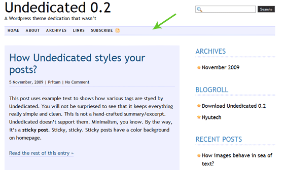
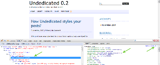
Right Click an empty area of the Navigation bar and select ‘Inspect Element‘ – Its added to the menu by Firebug. This brings up Firebug.
The right side shows the style used for the Navbar. look at the parameter that says background (the middle arrow). You can change the color of the navbar by changing that color value there (hex). Changing color in Firebug shows it instantly on the page, but it is lost upon reloading the page.
See the third arrow on the right? That’s the line number where the code is present in the stylesheet. Open up style.css in Notepad++. Press Ctrl + G to go to a line, give the line number as 373 (from the example) and you will see the same code there.
To change the color to green (the color of the arrow here for example), change #EFF0FF to #67c728. Save style.css and upload it to server. That’s it!
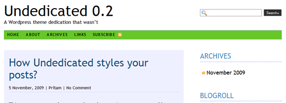
The Final Result - Green Navbar
Repeat the same on every element whose color you wish to change.
Add a Background Image
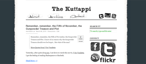
Here is a case study of my personal blog – Kuttappi. I have used the Cutline WordPress Theme. Just by adding a background image, the theme looks a lot different from its original.
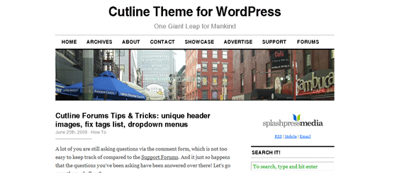
Original Cutline Theme by Chris Pearson
This is the one that is now live at Kuttappi.com
Now lets see how a background image works.
First you need a background image. The background image is often a small graphic that is repeated throughout the page, here is an example of one such image:
A Sample Background Image
When this background image is repeated over and over, we get the background and it looks like this:

When the Background Image is repeated
Making the Background Image
The width of the image depends on the width of the content area + Sidebar. In most themes it is denoted as the wrapper. In some others they call it the body. Open style.css and see the width of the wrapper (or that of the body). This is an example:
#wrapper
{
width: 641px;
margin: 0 auto;
background: #403f3f url(“/images/background.png”);
background-position: center;
background-repeat: repeat-y;
}
Here the width of the background image should be greater than 641px. Make one using GIMP or Photoshop. Sometimes its safe to copy one, oops, I mean, take inspiration from another free theme’s background 😉
The background is set by the third line of the code above. The color specified (#403f3f) could be the color of the side of the background (in the sample image above, the dark blackish border), so that the space beyond the image will blend in with the graphic.
The ‘background-position’ parameter center’s the background image and the ‘background-repeat’ parameter repeats the image throughout the length of the page in y direction.
You can use a height wise image as the background and make it repeat in x direction to get similar effect, but then you will have to use it with the outer wrapper, not the inner content wrapper. As an example check the RockinBlue WordPress Theme. Open up style.css and you can see these codes:
body
{
background: #ffffff url(images/blue.gif) top center repeat-x;
color: #000000;
}
This is the short-hand version of the same code we used in the first example. Here the image blue.gif is repeated in the x direction.
You can digg more about Background image here from w3Schools.
Use an Image Map in the Header
An Image Map is a single image graphic, but we can make portions of the image to link to different places. I have used an image map in my header here, here is an example which links to all my active social media profiles:

The good thing about image maps is that you can align the images any way you like without doing any CSS styling. Also, an image map loads faster than the individual images, since there is only one http request instead of 8 in the above example.
SBA of BWS has an excellent tutorial on making Image Maps:
In this tutorial you’ll learn how to map hot spots onto images for WordPress.org or Blogger blogs. Doing this can spice up your design and beef up your blog’s navigation. Remember, “a picture is often worth a thousand words”!
Learn how to make Image Maps: Use Image Maps to Add Link Hot Spots in Your Graphics
Add a Footer Section to the Theme
Many themes do not have a BIG FAT footer. A footer is a great way to promote your post and an ideal place to show off all those social media links. If your theme doesn’t have one, it would be a great idea to make one for yourself.
The footer is defined in the footer.php file. There are two ways to make a footer easily. Find yourself a theme that has footer already and get inspiration from it 😉
Or follow this tutorial on making a Widget Ready Footer and make one. Note that you will also have to edit the stylesheet to add footer styling for widgets.
One More Thing
Here are some additional minor tweaks to make the theme completely yours if you are that savvy:
- Remove unnecessary footer links that came with the theme.
- Edit the theme details in style.css and make it undetectable. (Not recommended, its always good to give back love to the makers).
- Checkout this collection of 50 WordPress Tutorials for more customization guides.
If I missed anything, feel free to ask them in comments. Enjoy Theme Hacking 🙂
If you enjoyed this post, please subscribe to my RSS Feed.





Hi Arun — long time no see. I’m flattered you mentioned my tutorial for making image maps (I know Mr I and I look alike but I’m prettier LOL; he’s absent from BWS at the moment, busy with his studies).
Seems I’ve been under-utilizing Firebug, in favor of Web Developer. Your post gave me some more options to explore.
I must say this is a stellar article that encourage readers to dig in and learn more. Customization is so important for branding. Serious bloggers need to understand the basics of what’s under the hood of a theme, if only to choose the right one for their blog. Great job.
I guess am just the opposite, I seldom use the Web Developer Toolbar, everything is done with Firebug.
Good to see you guys again, thanks!
Code names make it confusing, I just changed it to SBA 🙂
Great post. You can really customise free themes to a point that they no longer are recognised!
yep, totally 🙂
One awesome post, few days back i remember talking with you about wordpress theme making 😀 Now you have explained me very clearly .. will rip a free theme, make changes and release one 😀 TFS \m/
Lol, go ahead, you know releasing themes is a great way to get backlinks (via footer) 🙂
awesome tutorial loved it .. Th way you told is really good and impressive. this tends me to start making over for my current theme.. will sure do that and let u know abt that.. Kudos for this killer article..
Thanks Rajesh, I see that you are using Thesis. From my experience with Thesis, I have found that its very flexible and easily customisable theme, esp for beginners. But it gets a bit tricky when you edit it the usual way, they rewrite the css files rt?
Anyway good luck and do let me know 🙂
Arun, i like the example ” The Kuttappi “. 🙂
Thanks Anish, Kuttappi is a project that is close to my heart, I had always wanted a personal blog.
You have got a really fantastic website! Keep up the good work, I look forward to seeing more of your posts.
This is a great article. Very informative, with some great tools to get started!
I was wondering if you could tell us how you replaced the Image Header and text links in the Cutline theme, and replaced it with your Image Map Header. I.e. not how to create an image map, but where you modified the coding (which theme files), and what coding mods you did to eliminate the navigational text links, and just have the image map header. Thanks!
amazing news brother